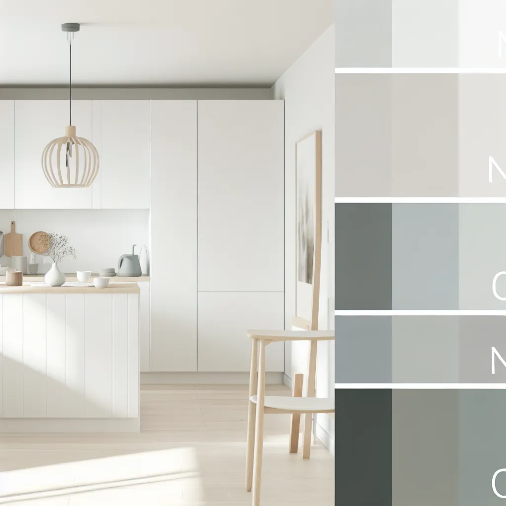
The Nordic Color Story
Scandinavian kitchens rely on a refined, limited color palette that creates visual calm while providing warmth and depth. This palette isn't about restriction—it's about intention. Every color serves a purpose, contributing to the overall sense of balance and serenity.
Our color choices reflect the Nordic landscape: the white of winter snow, the warm tones of pale wood, and the subtle grays of coastal stones.
Essential Colors
Pure White
#FAFAFA
The foundation color. Used for cabinets, walls, and large surfaces. Reflects maximum light and creates visual spaciousness.
Pale Oak
#D4C4B0
Warm wood tones that bring natural texture. Used for shelving, drawer dividers, and accent elements.
Muted Charcoal
#4A4A4A
Subtle contrast color. Used sparingly for hardware, lighting fixtures, and organizational details.
Light Gray
#F5F5F5
Soft neutral for secondary surfaces. Provides subtle variation without disrupting overall lightness.
Dark Oak
#8B7355
Deeper wood accent. Used for specific elements that require visual weight or emphasis.
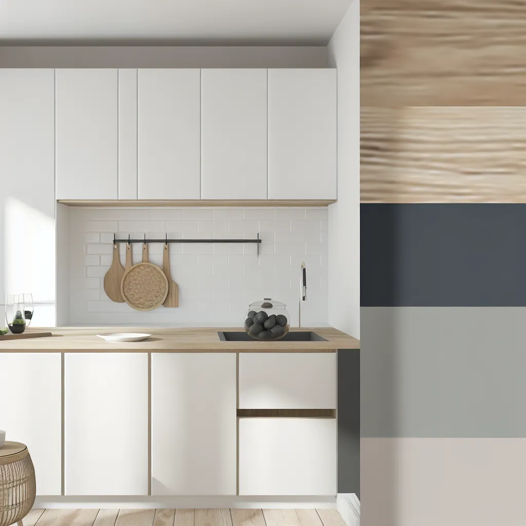
Color Application
The ratio matters as much as the colors themselves. Typically, white comprises 60-70% of the space, pale oak 20-25%, and charcoal/darker accents no more than 5-10%. This creates a bright, airy environment with warmth and subtle visual interest.
Natural materials introduce additional subtle color variations—the grain of oak, the variations in white ceramics, the slight color differences in natural stone. These variations add richness without disrupting the overall harmony.
Apply the Nordic Palette
Create your perfectly balanced Scandinavian kitchen with our expert color guidance.
Schedule Consultation